Some Matrix themes have specific HTML structures and styles. This guide will provide you with tips and suggestions for editing.
Templates with split menu
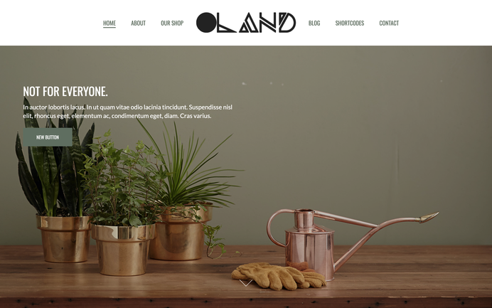
The templates with a split menu have a specific HTML structure for navigation. It's split into two parts: the first three navigation items are displayed on the left side, and all other items are on the right. The logo image is center-aligned and displayed in the middle between the left and right menus.

How to edit
This template is designed for websites with a slim navigation, allowing you to display three navigation items on the left and the same three items on the right. Of course, you'll need to consider the length of your menu. To customize the number of navigation items in your header, look for the following lines in your CSS:
/*** you hide the +4 items in the first left aligned menu ***/
.left-align nav ul li:nth-child(n+4) {
    display:none;
}

/*** you hide the first 3 items of your menu in the right  aligned menu ***/
.right-align nav ul li:nth-child(-n+3) {
    display:none;
}
The Oland theme has also an option to use a left logo with right aligned navigation. Go to the Style Editor and add the class 'has-left-logo' in global template configuration.
Templates with a sidebar menu
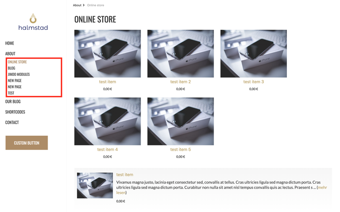
The Halmstad theme has a sidebar menu with standard Jimdo navigation.
Templates with split hero section
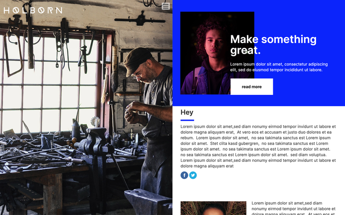
This type of template is perfect for blog websites. The entire template structure is divided into two parts: you can use an individual background image for each page on the left side, and your content section will be displayed on the right. It includes a hamburger menu, but note that some full-width features are not supported.


