Docs
-
01. Basics
-
02. Customizations
-
Helper classes
01
-
Image alt classes
02
-
Matrix Variables
03
-
Design kits
04
-
Onepager
05
-
Helper classes
-
03. Support issues
-
Common issues
01
-
Previous versions
02
-
Your questions
03
-
Common issues
Matrix Builder is a powerful and flexible toolkit designed to extend and customize your Jimdo website. It provides a simple way for you to enhance your site by injecting a menu where you can easily manage and add custom widgets, tools, and JavaScript plugins.
This toolkit allows you to integrate third-party services, install additional functionality, and access helpful documentation - all from one convenient place.

In the admin menu of Matrix Builder, you will find a section labeled "Shortcodes" Here, you can select and copy any widget code and paste it to your website into the module "Widget/HTML". These widgets can be used as standalone elements or added inside the module "Columns".

The block elements are full width sections that can include more than one custom widget.
You'll need to use a standalone module "Widget/HTML".
The block elements can be used only inside the standalone module "Widget/HTML" and can't be used inside the columns.
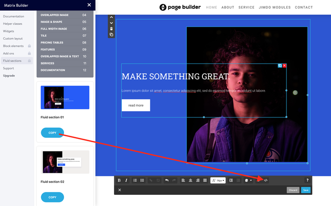
The fluid sections are pre-made full width custom sections using the advanced drag& drop editor. Once you click the copy button by selecting a custom section, you'll have to paste inside the module "Text"> Edit HTML. Then click the 'save' button and start editing with drag & drop tools.
The fluid sections have been deactivated in the latest version of Matrix Builder and are currently available only in Matrix Themes (Custom layout).
This section includes additional JS plugins that can be used on your website. You can install a parallax widget, an Instagram feed, or any other plugin based on your needs.
All add-on widgets can be edited in the "Widget/HTML" module.
In this section of Matrix Builder, you will find the following animation features:
Animations
- Global Animations
- Custom Animations
- Folded Animations
- Custom Tag Animations
- Scroll Animations
- Sticky Animations
- Animated Links
- Animated Titles
- Animated Buttons
- Floating Animations
The custom widgets including a photo can be changed for your own one.
- Go to Custom Layout and select the tab Files
- Upload your own image
- Once you upload your file ( the name of the file will be displayed in the list files), select it with right mouse over "copy link address" and paste it inside the Widget/HTML

 ...
 <img src="https://u.jimcdn.com/cms/o/s572cf8a914c2631f/userlayout/img/matrix-teaser.jpg?t=1405356750" alt="" /
 ...
Some of the custom widgets in Matrix Builder use icons from the Font Awesome framework. Check the link below for all available icons.
Check the following example of a widget using an icon from Font Awesome framework:
 <div class="fa fa-gem fa-4x">
 </div>
Icon size
To make the icons bigger, you can use the classes
fa-lx, fa-2x, fa-3x, fa-4x, fa-5x
The other method is using the inline style:
 <div class="fa fa-gem" style="font-size:30px;">
 </div>
Color setup
The same way with inline style you can change the color of the icon
 <div class="fa fa-gem" style="color:#ad1313;">
 </div>
The global color settings for custom widgets can be configured in the <Head>
section of your website (Menu > Settings > Edit Head).
<style>
/*<![CDATA[*/
/*** matrix builder config ***/
:root {
    --bg-primary: #2157FA;
    --bg-primary-light: #F1EEEE;
    --bg-primary-dark: #1E2022;
    --bg-secondary: #00ff91;
    --bg-secondary-dark: #3B28CC;
    --bg-gradient: linear-gradient(to right,var(--bg-primary), var(--bg-secondary));
    --bg-btn-01:#2157FA;
    --text-btn-01:#fff;
    --body-class: ;
  }
/*]]>*/
</style>
For additional colors, please refer to the 'helper classes' or use inline styles.
To preview the current global colors applied to your website, use the following code in the "Widget/HTML" module:

Style Guide
<div class="is-matrix bg-white br15 add-20" style="border:3px solid #F4F5F9;">
    <h3 style="color:#333;">
        Style Guide
    </h3>

    <div class="hr">
    </div>
    <br />

    <div class="is-matrix gap-15 is-card is-flex is-flex-column center-align cc-clearover">
        <div class="col-4 bg-primary color-white br15">
            <div class="gutter-20 center-align">
                <div class="fa fa-droplet fa-4x">
                </div>

                <p class="hs-center size-20 weight-600 add-top-10">
                    Color 1
                </p>

                <p>
                    bg-primary
                </p>
            </div>
        </div>

        <div class="col-4 bg-primary-light br15">
            <div class="gutter-20 center-align">
                <div class="fa fa-droplet fa-4x">
                </div>

                <p class="hs-center size-20 weight-600 add-top-10">
                    Color 2
                </p>

                <p>
                    bg-primary-light
                </p>
            </div>
        </div>

        <div class="col-4 bg-primary-dark color-white br15">
            <div class="gutter-20 center-align">
                <div class="fa fa-droplet fa-4x">
                </div>

                <p class="hs-center size-20 weight-600 add-top-10">
                    Color 3
                </p>

                <p>
                    bg-primary-dark
                </p>
            </div>
        </div>

        <div class="col-4 bg-secondary br15">
            <div class="gutter-20 center-align">
                <div class="fa fa-droplet fa-4x">
                </div>

                <p class="hs-center size-20 weight-600 add-top-10">
                    Color 4
                </p>

                <p>
                    bg-secondary
                </p>
            </div>
        </div>

        <div class="col-4 bg-secondary-dark color-white br15">
            <div class="gutter-20 center-align">
                <div class="fa fa-droplet fa-4x">
                </div>

                <p class="hs-center size-20 weight-600 add-top-10">
                    Color 5
                </p>

                <p>
                    bg-secondary-dark
                </p>
            </div>
        </div>
    </div>
    <br />

    <h3 style="color:#333;">
        Button styles
    </h3>

    <div class="hr">
    </div>
    <br />
    <a class="hs-button" href="#">Button Style 1</a><br />
    <br />
    <a class="hs-button br5" href="#">Button Style 2</a><br />
    <br />
    <a class="hs-button br500" href="#">Button Style 3</a><br />
    <br />

    <h3 style="color:#333;">
        Typography
    </h3>

    <div class="hr">
    </div>
    <br />

    <h1>
        Large Heading H1
    </h1>

    <div class="c">
    </div>

    <h2>
        Medium Heading H2
    </h2>

    <div class="c">
    </div>

    <h3>
        Small Heading
    </h3>

    <div class="c">
    </div>

    <p>
        This is a simple text, Vivamus quis mi. Curabitur a felis in nunc fringilla tristique. Donec posuere vulputate arcu. Nunc sed turpis. Praesent porttitor, nulla vitae posuere iaculis, arcu
        nisl dignissim dolor, a pretium mi sem ut ipsum.
    </p>

    <p>
        This is a <a href="/" title="Home">simple link</a>.
    </p>
    <br />

    <h3 style="color:#333;">
        Custom widgets
    </h3>

    <div class="hr">
    </div>
    <br />

    <div class="is-matrix is-card content-teaser bg-primary-light is--flex is-flex-block cc-clearover">
        <div class="left-align col-8 add-20 cc-box">
            <h3>
                Make it Stand Out
            </h3>

            <p>
                Premium Jimdo Theme coupled with advanced functionality and awesome support Aenean imperdiet. Aenean posuere, tortor sed cursus feugiat, nunc augue blandit nunc, eu sollicitudin urna
                dolor sagittis lacus.
            </p>
        </div>

        <div class="right-align col-4 add-20 cc-box">
            <a class="hs-button mid-round right-align" href="https://www.matrix-themes.com/" target="">learn more</a>
        </div>
    </div>
    <br />
</div>
You can configure custom global body classes to enable further customizations for default Jimdo elements or modify specific styles. For example, to hide the Matrix Builder admin menu, you can add the class is-white-label
--body-class: is-white-label;
For multiple body classes, simply separate them with a space.
--body-class: your-class another-class;
Each admin section has a guestbook where you can leave a comment or a support question.
Email support is available only in Premium plan.
The helper classes (or utility classes) are custom CSS classes designed to modify the styles of custom widgets and elements. Let's have a look at some examples:
This is the default style of the 'Button' widget, and its background color is defined by the global colors in the <head> section
<a class="hs-button" href="https://www.matrix-themes.com/" target="">Button</a>
So, to customize it, you can use the inline style like this
<a class="hs-button" style="background:#3b28cc;border-radius:2px;font-size:16px;" href="https://www.matrix-themes.com/" target="">Button</a>
And here's an example to make the same styles using the helper classes:
<a class="hs-button bg-pumpkin br2 size-16" href="https://www.matrix-themes.com/" target="_blank">Button</a>
In our second example we used the following helper classes:
bg-pumpkin - background: #D35400;
br2 - border-radius: 2px;
size-16 - font-size:16px;
The helper classes can be applied for any widgets in order to display different styles with padding, margin, colors etc. The full list of helper classes and other examples can be found in Matrix Builder menu> Helper classes
Image Alt classes refer to default customized Jimdo widgets that do not require any programming knowledge to use. Instead, you can utilize the "ALT text" field to manipulate various aspects of your images, such as making them fullwidth, adding parallax effects, and adjusting the border radius value. These features provide a user-friendly and intuitive way to enhance the visual design of your website without needing to write any code.

For a more detailed tutorial, complete with screenshots and examples, please visit the documentation page.
Documentation
Matrix Variables are custom tags used inside the columns to alter the whole parent module Columns. You can add any background color or change the styles of any element that will be displayed inside the columns.
See the below guide:
Display any content inside of your module 'Columns' ( text, images, contact form or any other element )
Inside of the one column, add the module 'Widget/HTML' with the following tag:
<var> hs-fullwidth bg-primary color-white </var>
Refresh the page to see your columns wrapped in fullwidth brand background color and white text. You can further customize it for example your buttons or other elements.
Using a specific Jimdo template, you can fully customize the design, including the underlined animation menu and large content section.
How it works
Copy one of the codes below and paste it inside the Edit Head section (Menu > Settings > Edit Head).
The custom styles can be applied only for specific Jimdo templates!
Malaga template
design kit
<style>
/* <![CDATA[ */
/*** Design kit for Malaga template ***/
.jtpl-header{-webkit-box-shadow:0 0 18px 1px rgb(0 0 0 / 10%);box-shadow:0 0 18px 1px rgb(0 0 0 / 10%)}.jtpl-section-main{margin:85vh auto 0;background:#fff;max-width:inherit!important}@media only screen and (max-width:745px){.jtpl-section-main{margin:45vh auto 0}.jtpl-background-area{position:absolute;height:45vh}}.jtpl-navigation,.jtpl-topbar-section{margin:0 auto;max-width:1170px}.jtpl-navigation .j-nav-level-1,.jtpl-navigation .j-nav-level-2{box-shadow:0 7px 11px 0 rgba(0,0,0,.2);border:0 solid #aaa;border:0 solid rgba(0,0,0,.1);min-width:180px;text-align:left}.jtpl-navigation .j-nav-level-2{border-left:none;left:-100%;top:-1px}.jtpl-navigation li.jmd-nav__list-item-0{margin:5px 0;padding:0}.jtpl-navigation li.jmd-nav__list-item-0>a{background:0 0!important;padding:0!important;margin:3px 20px!important;color:inherit!important}.jtpl-navigation .j-nav-variant-nested *{box-sizing:border-box}.jtpl-navigation .j-nav-variant-nested a{padding:.2em 0;position:relative}.jtpl-navigation .j-nav-variant-nested a:after,.jtpl-navigation .j-nav-variant-nested a:before{position:absolute;-webkit-transition:all .35s ease;transition:all .35s ease}.jtpl-navigation .j-nav-variant-nested a:before{content:'';position:absolute;width:100%;transform:scaleX(0);height:2px;z-index:-1;bottom:0;left:0;background-color:currentColor;transform-origin:bottom right;transition:transform .4s cubic-bezier(.86, 0, .07, 1)}.jtpl-navigation .j-nav-variant-nested ul li ul a:before{height:0}.jtpl-navigation .j-nav-variant-nested a:after{left:0;top:0;padding:.5em 0;position:absolute;content:attr(data-hover);color:currentColor;white-space:nowrap;max-width:0%;overflow:hidden}.jtpl-navigation .j-nav-variant-nested .current a:before,.jtpl-navigation .j-nav-variant-nested a:hover:before,.jtpl-navigation .j-nav-variant-nested ul li.cc-nav-current>a:before,.jtpl-navigation .j-nav-variant-nested ul li.cc-nav-parent>a:before{opacity:1;width:100%;transform:scaleX(1);transform-origin:bottom left}.jtpl-navigation .j-nav-variant-nested .current a:after,.jtpl-navigation .j-nav-variant-nested a:hover:after{max-width:100%}#cc-inner .jtpl-navigation .jtpl-navigation .j-nav-level-2{left:-100%!important}.jtpl-breadcrumb,.jtpl-content,.jtpl-footer__inner,.jtpl-header__inner,.jtpl-sidebar__inner{max-width:1170px}
/*]]>*/
</style>
Rome template
design kit
<style>
/* <![CDATA[ */
/*** Design kit for Rome template ***/
.jtpl-navigation__inner li.jmd-nav__list-item-0{margin:5px 0;padding:0}.jtpl-navigation__inner li.jmd-nav__list-item-0>a{background:0 0!important;padding:0!important;margin:3px 20px!important}.jtpl-navigation__inner .j-nav-variant-nested *{box-sizing:border-box}.jtpl-navigation__inner .j-nav-variant-nested a{padding:.2em 0;position:relative}.jtpl-navigation__inner .j-nav-variant-nested a:after,.jtpl-navigation__inner .j-nav-variant-nested a:before{position:absolute;-webkit-transition:all .35s ease;transition:all .35s ease}.jtpl-navigation__inner .j-nav-variant-nested a:before{bottom:0;display:block;height:2px;width:0%;content:"";background-color:currentColor}.jtpl-navigation__inner .j-nav-variant-nested ul li ul a:before{height:0}.jtpl-navigation__inner .j-nav-variant-nested a:after{left:0;top:0;padding:.5em 0;position:absolute;content:attr(data-hover);color:currentColor;white-space:nowrap;max-width:0%;overflow:hidden}.jtpl-navigation__inner .j-nav-variant-nested .current a:before,.jtpl-navigation__inner .j-nav-variant-nested a:hover:before,.jtpl-navigation__inner .j-nav-variant-nested ul li.cc-nav-current>a:before,.jtpl-navigation__inner .j-nav-variant-nested ul li.cc-nav-parent>a:before{opacity:1;width:100%}.jtpl-navigation__inner .j-nav-variant-nested .current a:after,.jtpl-navigation__inner .j-nav-variant-nested a:hover:after{max-width:100%}#cc-inner .jtpl-navigation__inner .jtpl-navigation .j-nav-level-2{left:-100%!important}.jtpl-breadcrumb,.jtpl-content,.jtpl-footer__inner,.jtpl-header__inner,.jtpl-sidebar__inner{max-width:1170px}
/*]]>*/
</style>
Prague template
design kit
<style>
/* <![CDATA[ */
/*** Design kit for Prague template ***/
.jtp-sidebar__inner,.jtpl-breadcrumb,.jtpl-content,.jtpl-footer__inner,.jtpl-header__inner,.jtpl-main__inner{max-width:1170px;border-radius:0;box-shadow:none}.jtpl-mobile-navigation__inner .j-nav-current>a:link,.jtpl-mobile-navigation__inner .j-nav-current>a:visited,.jtpl-mobile-navigation__inner .j-nav-parent>a:link,.jtpl-mobile-navigation__inner .j-nav-parent>a:visited,.jtpl-mobile-navigation__inner a:active,.jtpl-mobile-navigation__inner a:focus,.jtpl-navigation__inner .j-nav-current>a:link,.jtpl-navigation__inner .j-nav-current>a:visited,.jtpl-navigation__inner .j-nav-parent>a:link,.jtpl-navigation__inner .j-nav-parent>a:visited,.jtpl-navigation__inner a:active,.jtpl-navigation__inner a:focus{font-weight:inherit}.jtpl-breadcrumb{margin:0 0 10px}.j-website-title-content,.jtpl-navigation{padding:10px 0}.jtpl-navigation__inner li.jmd-nav__list-item-0{margin:5px 0;padding:0}.jtpl-navigation__inner li.jmd-nav__list-item-0>a{background:0 0!important;padding:0!important;font-weight:400;margin:3px 20px!important}.jtpl-navigation__inner .j-nav-variant-nested *{box-sizing:border-box}.jtpl-navigation__inner .j-nav-variant-nested a{padding:.2em 0;position:relative}.jtpl-navigation__inner .j-nav-variant-nested a:after,.jtpl-navigation__inner .j-nav-variant-nested a:before{position:absolute;-webkit-transition:all .35s ease;transition:all .35s ease}.jtpl-navigation__inner .j-nav-variant-nested a:before{bottom:0;display:block;height:2px;width:100%;content:"";background-color:currentColor;transform:scaleX(0);transition:.25s linear}.jtpl-navigation__inner .j-nav-variant-nested ul li ul a:before{height:0}.j-nav-variant-nested a:after{left:0;top:0;padding:.5em 0;position:absolute;content:attr(data-hover);color:currentColor;white-space:nowrap;max-width:0%;overflow:hidden}.jtpl-navigation__inner .j-nav-variant-nested .current a:before,.jtpl-navigation__inner .j-nav-variant-nested a:hover:before,.jtpl-navigation__inner .j-nav-variant-nested ul li.cc-nav-current>a:before,.jtpl-navigation__inner .j-nav-variant-nested ul li.cc-nav-parent>a:before{opacity:1;width:100%;transform:scaleX(1)}.jtpl-navigation__inner .j-nav-level-1::before{left:50%;margin-left:0;border-left:none;border-top:none;opacity:0}.jtpl-navigation__inner .j-nav-level-1,.jtpl-navigation__inner .j-nav-level-2{border:none;border-top:none;padding:0}
/*]]>*/
</style>
Osaka template
design kit
<style>
/* <![CDATA[ */
/*** Design kit for Osaka template ***/
.jtpl-topbar-section{max-width:100%}.jtpl-title{margin:85px auto 50vh}.jtpl-logo,.jtpl-navigation{padding-left:20px;padding-right:20px}.jtpl-section-aside,.jtpl-section-main{max-width:1200px}.jtpl-navigation{box-shadow:none;padding:20px 0}.jtpl-navigation li.jmd-nav__list-item-0>a{background:0 0!important;padding:2px 0!important;margin:5px 20px!important}.jtpl-navigation li.jmd-nav__list-item-1>a,.jtpl-navigation li.jmd-nav__list-item-2>a{padding:10px!important;margin:0!important;border-color:transparent!important}.jtpl-navigation .j-nav-variant-nested *{box-sizing:border-box}.jtpl-navigation .j-nav-variant-nested a{padding:.2em 0;position:relative}.jtpl-navigation .j-nav-variant-nested a:after,.jtpl-navigation .j-nav-variant-nested a:before{position:absolute;-webkit-transition:all .35s ease;transition:all .35s ease}.jtpl-navigation .j-nav-variant-nested a:before{bottom:0;display:block;height:1px;width:0%;content:"";background-color:currentColor}.jtpl-navigation .j-nav-variant-nested ul li ul a:before{height:0}.jtpl-navigation .j-nav-variant-nested a:after{left:0;top:0;padding:.5em 0;position:absolute;content:attr(data-hover);color:currentColor;white-space:nowrap;max-width:0%;overflow:hidden}.jtpl-navigation .j-nav-variant-nested .current a:before,.jtpl-navigation .j-nav-variant-nested a:hover:before,.jtpl-navigation .j-nav-variant-nested ul li.cc-nav-current>a:before,.jtpl-navigation .j-nav-variant-nested ul li.cc-nav-parent>a:before{opacity:1;width:100%}.jtpl-navigation .j-nav-variant-nested .current a:after,.jtpl-navigation .j-nav-variant-nested a:hover:after{max-width:100%}.j-website-title-content:not(:empty):after,.j-website-title-content:not(:empty):before{background:0 0}.jtpl-navigation .j-nav-level-0>li>a:link,.jtpl-navigation .j-nav-level-0>li>a:visited{border-top-width:0}.jtpl-background-area{height:70vh}.jtpl-background-area:after{content:'';display:block;background:rgba(0,0,0,.4);position:absolute;top:0;left:0;margin-bottom:0;width:100%;height:100%}
/*]]>*/
</style>
A one-pager is an ideal solution for quickly creating a landing page or showcasing a new product. To use this feature, navigate to admin mode, hide the Jimdo navigation, and then add a scroll menu to the content section as a widget or HTML element.

<style>
/*<![CDATA[*/
.cc-section {
   margin-top: -100px;
   padding-top: 100px;
}

.cc-section:first-child .section {
   padding-top: 100px;
}

@media only screen and (max-width: 1023px){
.cc-section{
   margin-top: 5px;
   padding-top: 5px;
}

.cc-section:first-child .cc-section {
   padding-top: 5px;
  }
}
/*]]>*/
</style>
<!-- start scroll nav menu -->
<div class="hs-menu onepager draggable-header">
    <nav>
        <ul>
            <li>
                <a href="#home">Home</a>
            </li>

            <li>
                <a href="#about">About</a>
            </li>

            <li>
                <a href="#service">Service</a>
            </li>

            <li>
                <a href="#contact">Contact</a>
            </li>
        </ul>
    </nav>
</div>
<!-- end scroll nav menu -->
<div class="matrix-msg invisible">
    One Pager menu
</div>
When the page is refreshed, the menu will appear just below the navigation bar. However, it can still be edited in the same location where it was originally added.
To add anchor sections, begin each section by adding a Widget/HTML module with the following code where "anchor-name" is the unique identifier for that section. This will create a linkable destination for navigation within the page.
<div class="cc-section" id="home">
    <span>Home</span>
</div>
<div class="cc-section" id="about">
    <span>About</span>
</div>
<div class="cc-section" id="contact">
    <span>Contact</span>
</div>
One pager and Jimdo templates.
The scroll menu is compatible with all Jimdo templates, however, if you are using a template with a vertical navigation menu, you will need to add the additional class 'is-vertical' to the 'onepager' element in order for it to function correctly:
<div class="hs-menu onepager is-vertical">
To ensure proper functionality, the offset of the anchor sections should closely match the height of the header. By default, the offset is set to 100px. To adjust this value, you can edit the following part of the code separately for desktop and mobile devices
<style>
/*<![CDATA[*/
.cc-section {
   margin-top: -100px;
   padding-top: 100px;
}

.cc-section:first-child .cc-section {
   padding-top: 100px;
}

@media only screen and (max-width: 1023px){
.cc-section{
   margin-top: 5px;
   padding-top: 5px;
}

.cc-section:first-child .cc-section {
   padding-top: 5px;
  }
}
/*]]>*/
</style>
External pages
In order to include external pages within your scroll menu and to make your navigation accessible to other pages of your website (e.g. privacy policy, 404 page, sitemap, blog posts, etc.), you will need to add the full URL of your website and place the scroll menu to the footer/sidebar of your website
<li>
   <a href="https://www.matrix-themes.com/#home">Home</a>
</li>
The issue with JS
The file 'matrix-builder.js' includes the latest version of jQuery. If you're using another version of the same library, you might have a conflict between 2 libraries.
{Solution}: remove all jQuery libraries from your website except that one included in the 'matrix-builder.js bundle.
Documentation

| bg-primary | |
| bg-primary-light | |
| bg-primary-dark | |
| bg-secondary | |
| bg-secondary-dark |
| body | |
| top-header | |
| top-header-inner | |
| header | |
| header-inner | |
| navigation-inner | |
| navigation color | |
| dropdown background color | |
| content |
| background | |
| text color | |
| link color | |
| horizontal line |
| style 1 | |
| style 2 | |
| style 3 | |
| text color |
| background color | |
| navigation color |
| social icons | |
| top header border | |
| header border | |
| nav inner border |
| Template configurations | |
|
|
| Top header inner | |
| Header inner | |
| Navigation inner | |
| Navigation styles | |
| snip-nav --line01 is-uppercase | |
| Sub-menu (breadcrumbs) styles | |
| size-15 | |
| Mobile Navigation styles | |
| size-30 | |
| Content styles | |
| form-white | |
| Footer styles | |
| o-form color-white white-outline-btn | |
| Footer background image | |
|
Typography |
|
| Heading H1 | |
| weight-400 | |
| Heading H2 | |
| weight-400 | |
| Heading H3 | |
| weight-400 | |
| Buttons | |
| weight-400 | |
| Advanced settings | |
| Custom CSS | |
|
#cc-inner .my-class { color:#f0f0f0; }
|
Note: All changes made here will be applied to your entire website.
stoobz (Thursday, 28 July 2022 22:43)
Hey hello, I wanted to place a message on top, that I am away on vacation. I put it with the social Media icons into the footer, so that it shows up on top.
And it works, but only for the desktop-version.
On my mobile it appears in the footer.
</style><div class="hs-social left-align new-social small-social size-11 is-circle-border link-bright is-rounded hs-magic">
<font size="4" color="white"><marquee width="600" height="25">Hallo ihr Lieben - wir machen kurz Sommerferien und sind ab dem 18.8.2022 wieder für euch da ;)</marquee></font> <a href=
"https://www.pinterest.de/stubenrauchhamburg/" target="_blank" class="fa fa-pinterest fa-2x add-right-5"></a>
</div>
<div class="only-mobile">
<font size="3" color="white"><marquee width="300" height="25">Hallo ihr Lieben - wir machen kurz Sommerferien und sind ab dem 18.8.2022 wieder für euch da ;)</marquee></font>
</div>
Can you please tell me what I am missing? THanks alot in advance!!
Cheers,
stoobz.
Matrix themes (Friday, 01 July 2022 18:18)
@Stefan B
https://www.matrix-themes.com/support/documentation/#link8
or in Matrix Theme menu >Quick setup
Stefan B. (Friday, 01 July 2022 13:53)
Hello,
how can I move my logo so that it appears in the upper left corner of my website and will then appear within the navigation bar?
Matrix themes (Wednesday, 06 October 2021 10:01)
@Erika no, it's not possible
Erika B. (Wednesday, 06 October 2021 01:38)
Hallo,
thank you for the previous support.
Can you tell me please if it 's possible to get the WHOLE contact page in one color ( not only the header ) , except the contact "window" ( which can stay white ). Have it seen so many times on th internet. And I wonder if it's possible in here.
My theme is New York by the way.
Thank you for you help.
Best Greetings
Matrix themes (Monday, 04 October 2021 09:55)
@Erika https://help.jimdo.com/hc/en-us/articles/115005538586
Erika B. (Monday, 04 October 2021 04:05)
Hallo,
the hero pictures of my website are not responsive on the mobile version/ I see only one part of them. What could be wrong?
Matrix themes (Wednesday, 27 January 2021 22:51)
@Carsten the class lazy should be used for a single module or widget and never for the whole website
Carsten Mueller (Wednesday, 27 January 2021 14:05)
There is LazyLoad installed on our website. Is it working for the whole website, or do we need to add an attribute to every picture to have it function?
Thank you.