The helper classes (or utility classes) are custom CSS classes designed to modify the styles of custom widgets and elements. Here's a list of the most commonly used helper classes in Matrix Builder:
01. background colors
| bg-transparent | The transparent background color |
| bg-primary | The main accent background color |
| bg-secondary | The secondary accent background color |
| bg-primary-dark | The primary dark background color (footer) |
| bg-secondary-dark | The secondary dark background color |
| bg-white | White background color |
| bg-dark | |
| bg-turquoise | |
| bg-emerald | |
| bg-peter-river | |
| bg-amethyst | |
| bg-wet-asphalt | |
| bg-green-sea | |
| bg-nephritis | |
| bg-belize-hole | |
| bg-wisteria | |
| bg-midnight-blue | |
| bg-sun-flower | |
| bg-carrot | |
| bg-alizarin | |
| bg-clouds | |
| bg-concrete | |
| bg-orange | |
| bg-pumpkin | |
| bg-pomegranate | |
| bg-silver | |
| bg-asbestos | |
| bg-red | |
| bg-blue | |
| bg-green | |
| bg-yellow | |
| bg-pink | |
| bg-purple | |
| bg-amber | |
| bg-lime | |
| bg-brown | |
| bg-teal | |
| bg-cyan | |
| bg-gray | |
| bg-gradient-1 | The background gradient style 1 |
| bg-gradient-2 | The background gradient style 2 |
| bg-gradient-3 | The background gradient style 3 |
02. text color and link
| color-dark | The headings and text color #000000 |
| color-white | The headings and text color #ffffff |
| link-white | The global link color #ffffff |
| link-dark | The global link color #000000 |
| link-grey | The global link color #cccccc |
| has-dark-link | The text color in custom buttons (not hover) |
03. padding and margin
| no-padding | padding:0px |
| add-5 | padding:5px |
| add-10 | padding:10px |
| add-15 | padding:15px |
| add-20 | padding:20px |
| add-25 | padding:25px |
| add-30 | padding:30px |
| no-margin | margin:0 |
| pull-top | margin-top:-15px |
| pull-btm | margin-bottom:-15px |
04. alignment
| hs-left | float:left |
| hs-right | float:right |
| hs-center | float:none |
| text-left | text-align:left |
| text-right | text-align:right |
| text-center | text-align:center |
| is--left | left-align (Flexbox) |
| is--right | right-align (Flexbox) |
| is--center | center-align (Flexbox) |
05. text size and font weight
| size-11 | font-size:11px |
| size-12 | font-size:12px |
| size-13 | font-size:13px |
| size-14 | font-size:14px |
| size-15 | font-size:15px |
| size-16 | font-size:16px |
| size-17 | font-size:17px |
| size-18 | font-size:18px |
| size-19 | font-size:19px |
| size-20 | font-size:20px |
| size-25 | font-size:25px |
| size-30 | font-size:30px |
| has-large-text | font-size:300% (only desktop) |
| has-large-mobile | font-size:300% (desktop & mobile) |
| has-super-large-text | font-size:500% (only desktop) |
| weight-300 | font-weight:300 |
| weight-400 | font-weight:400 |
| weight-500 | font-weight:500 |
| weight-600 | font-weight:600 |
| weight-700 | font-weight:700 |
| weight-800 | font-weight:800 |
06. position
| rel | position:relative |
| absolute-top-left | position:absolute;top:0;left:0; |
| absolute-top-right | position:absolute;top:0;right:0; |
| absolute-btm-left | position:absolute;bottom:0;left:0; |
| absolute-btm-right | position:absolute;bottom:0;right:0; |
| fixed | position:fixed (used only for sticky elements in HTML) |
07. display desktop or mobile only
| only-mobile | Display only for tablet and mobile |
| only-mobile-phone | Display only for mobile |
| hide-mobile | Display only for desktop |
| hide-mobile-only | Display only for desktop and tablet |
08. hero overlay opacity
| opacity-8 | opacity:0.8 |
| opacity-6 | opacity:0.6 |
| opacity-4 | opacity:0.4 |
| opacity-2 | opacity:0.2 |
09. grid columns
| col-12 | width: 100% |
| col-11 | width: 91.66666667% |
| col-10 | width: 83.33333333% |
| col-9 | width: 75% |
| col-8 | width: 66.66666667% |
| col-7 | width: 58.33333333% |
| col-6 | width: 50% |
| col-5 | width: 41.66666667% |
| col-4 | width:33.33333333% |
| col-3 | width:25% |
| col-2 | width:16.66666667% |
| col-1 | width:8.33333333% |
| col-0 | width:auto |
10. buttons
| mid-round | border:none |
| bg-round | border:1px solid #303030 |
| ghost-dark | box-shadow: 0px 17px 35px rgba(74,74,115,0.1), 0px 5px 15px rgba(0,0,0,0.07) |
| ghost-white | text-shadow: 2px 4px 3px rgba(0,0,0,0.3) |
| has-flat-style | box-shadow: 0 -3px 0 rgba(0, 0, 0, 0.1) inset |
| fullwidth-btn | width:100% |
| small-btn | padding: 12px 25px |
| large-btn | padding: 15px 55px |
11. mobile text size
| m-size-11 | font-size:11px |
| m-size-12 | font-size:12px |
| m-size-13 | font-size:13px |
| m-size-14 | font-size:14px |
| m-size-15 | font-size:15px |
| m-size-16 | font-size:16px |
| m-size-17 | font-size:17px |
| m-size-18 | font-size:18px |
| m-size-19 | font-size:19px |
| m-size-20 | font-size:20px |
| m-size-25 | font-size:25px |
| m-size-30 | font-size:30px |
| m-size-35 | font-size:35px |
| m-size-40 | font-size:40px |
| m-size-45 | font-size:45px |
| m-size-50 | font-size:50px |
| m-size-55 | font-size:55px |
| m-size-60 | font-size:60px |
13. mobile text size for inline styles
| m-span-20 | font-size:20px |
| m-span-25 | font-size:25px |
| m-span-30 | font-size:30px |
| m-span-35 | font-size:35px |
| m-span-40 | font-size:40px |
| m-span-45 | font-size:45px |
| m-span-50 | font-size:50px |
| m-span-55 | font-size:55px |
| m-span-60 | font-size:60px |
Global Helper classes
The classes used only as variables and define the global section styles.
| form-white | contact form for white background |
| form-dark | contact form for dark background |
| o-form | contact form for colored background (opacity) |
| mid-round-btn | default Jimdo buttons with border-radius:5px |
| round-btn | default Jimdo buttons with border-radius:500px |
| dark-outline-btn | default Jimdo buttons with dark outlined styles |
| white-outline-btn | default Jimdo buttons with white outlined styles |
| color-hr | horizontal line with accent background color |
| dark-hr | horizontal line with dark background color |
| white-hr | horizontal line with white background color |
| grey-hr | horizontal line with grey background color |
The body classes
With the body classes you can change the global styles of a specific page ( Settings> Edit Head> Select a page)
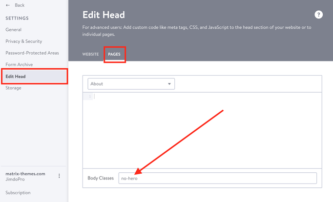
| no-hero | hide the hero image |
Matrix Variables
The classes available as Matrix variables and can be used only inside the Columns module
| is-overlay | display the overlay widget |
| is-overlay is-white | display the overlay widget with white caption background |
| is-teaser | applied for Text with Photo module |
| is-fullwidth | display fullwidth any Jimdo element |
| hs-fullwidth | display the fullwidth background |
Documentation

| bg-primary | |
| bg-primary-light | |
| bg-primary-dark | |
| bg-secondary | |
| bg-secondary-dark |
| body | |
| top-header | |
| top-header-inner | |
| header | |
| header-inner | |
| navigation-inner | |
| navigation color | |
| dropdown background color | |
| content |
| background | |
| text color | |
| link color | |
| horizontal line |
| style 1 | |
| style 2 | |
| style 3 | |
| text color |
| background color | |
| navigation color |
| social icons | |
| top header border | |
| header border | |
| nav inner border |
| Template configurations | |
|
|
| Top header inner | |
| Header inner | |
| Navigation inner | |
| Navigation styles | |
| snip-nav --line01 | |
| Sub-menu (breadcrumbs) styles | |
| size-15 | |
| Mobile Navigation styles | |
| size-30 | |
| Content styles | |
| form-white | |
| Footer styles | |
| o-form color-white white-outline-btn | |
| Footer background image | |
|
Typography |
|
| Heading H1 | |
| weight-400 | |
| Heading H2 | |
| weight-400 | |
| Heading H3 | |
| weight-400 | |
| Buttons | |
| weight-400 | |
| Advanced settings | |
| Custom CSS | |
|
#cc-inner .my-class { color:#f0f0f0; }
|
Note: All changes made here will be applied to your entire website.