Docs
-
01. Basics
-
02. Initial setup
-
How to add a logo image
01
-
Matrix Style editor
02
-
Style guide
03
-
Typography
04
-
Google Fonts
05
-
How to add a logo image
-
03. Theme options
-
Hero section
01
-
Hero title
02
-
Header social links
03
-
Top Header section
04
-
Smart menus
05
-
Split menu
06
-
Megamenu
07
-
One pager
08
-
Multilingual themes
09
-
Hero section
-
04. Customizations
-
05. Troubleshooting
There are 5 components of Matrix theme:
1. HTML ( Design> Custom Template> HTML )
2. CSS ( Design> Custom Template> CSS )
3. CSS components ( Design> Custom template> Files)
- 04.custom-widgets.css
- 05.helper-classes.css
- 06.media-queries.css
- 07.admin-menu.css
- 08.libraries.css
- 09.updates.css
- 10.style-editor.css
4. Font Awesome icons ( Design> Custom template> Files)
5. JS file ( Design> Custom Template> Files )
matrix.js
To install the same template on one of your websites, simply use a text editor to save the HTML and CSS.
The CSS components, Font Awesome icons, and JS file can be found in the 'Updates' section of the Matrix themes menu for your convenience. This will make it easy for you to access and implement these components as needed for your website.
The custom widgets of Matrix Themes are available in section 'Components'. You can select any widget using the copy button and paste the code inside 'Widget/HTML' module.
To change the custom widgets, including a photo, to your own, please follow these steps:
- Go to Custom Layout and select the Files tab
- Upload your own image by using the upload button.
- Once the file has been successfully uploaded, you will see the name of the file displayed in the list of files.
- Right-click on the file and select "Copy link address."
- Paste the link in the appropriate location within the Widget/HTML.
...
  <img src="https://u.jimcdn.com/cms/o/s572cf8a914c2631f/userlayout/img/matrix-teaser.jpg?t=1405356750" alt="" /
...
For a more detailed tutorial, complete with screenshots and examples, please visit the documentation page.
Documentation
The Matrix Themes and some of the custom widgets are using the Font Awesome framework.
Please check the below link with all available icons:
Check the following example of a widget using an icon from Font Awesome framework:
 <div class="fa fa-gem fa-4x">
 </div>
Icon size
To make the icons bigger, you can use the classes
fa-lx, fa-2x, fa-3x, fa-4x, fa-5x
The other method is using the inline style:
 <div class="fa fa-gem" style="font-size:30px;">
 </div>
Color setup
The same way with inline style you can change the color of the icon
 <div class="fa fa-gem" style="color:#ad1313;">
 </div>

Log in to your Jimdo website and go to the Matrix Themes admin menu.
Navigate to the Support section (accessible through the provided link during initial installation). You can leave general comments at the bottom of the page for general questions. For specific issues, please use the contact form.
02. Initial setup
How to add logo image
The logo image in Matrix Themes can be changed with drag&drop tools.
Add a module 'Columns' to your footer section with only one column
Inside the column, add a module 'Widget/HTML' with the following code:
<var> draggable-logo </var>
Click the button "apply the styles" of the style editor or just reload the page to see the column in header section where you can add your logo using the module 'Photo'. Please don't forget to add a link to it of your homepage;)
Matrix themes come with an Advanced Style Editor, which allows you to set up global colors, fonts, and template design options.
Here’s how to install it:
In the Matrix themes admin menu, navigate to "Templates" (or "Design Library" in previous theme versions). Choose the design for your website by clicking the Copy button next to the selected design.
Add a module 'Columns' to your footer with only one column(!). Inside the 'Columns' add the module 'Tables', Click on 'Edit HTML' button and replace the existing code with the one you copied and at the end click the save button.
Opening again the "Templates" section, locate the "JS Code Editor" and copy it. Paste the code inside the "Widget/HTML" module just below the "Tables" you added to your website. Ensure that both the Tables and Widget/HTML modules are placed within the same column module.
Refresh the page to see the "Columns" module appear at the top of the style editor. Once it's visible, you can start editing your website using the Advanced Style Editor
For a more detailed tutorial, complete with screenshots on installing and editing the style editor, please visit the documentation page.
Documentation
After installing the Style editor, you can paste the code below into Widget/HTML to see the general design styles.
Setup the global color of the links, text, headings and horizontal line in content section in Menu> Design> Font Settings
For a more detailed tutorial, complete with screenshots and examples, please visit the documentation page.
Documentation
01. Copy the below preset font and paste it to Edit Head section ( in Admin menu> Settings> Edit Head )
 <link href="https://fonts.jimstatic.com/css?family=Poppins:400,500,600,700,800" rel="stylesheet" type="text/css"/>

<style>
/* <![CDATA[ */
:root {
--primary-font: 'Poppins', sans-serif;
}

/*]]>*/
</style>
To change the preset google font, just change the font name (yellow color) for your own one.
Use the style editor > template configuration to apply google font for the whole website or just for a specific section.
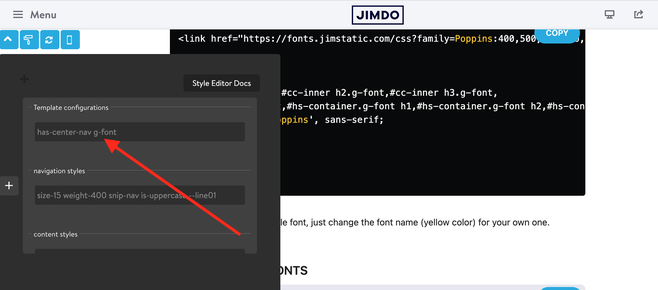
Preset Google fonts
The hero section in Matrix Themes is edited in Design> Background . You can choose a simple image, slideshow, video or background color for each page of your website.
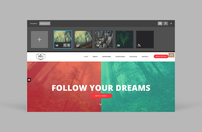
How to activate
1. In admin menu > Design> Background select an image to display on your page.
2. On the top of content section add the module 'Columns' and inside of it display 'widget/HTML' with the following code:
<var> draggable-hero color-white g-font </var>
3. Click the 'Apply the styles' button of the style editor or reload the page to see the columns module inside the hero section.
4. Adding the module 'Spacing' you can resize the hero section for your own preference.
All available classes
| color-white | adds white color text |
| has-transparent-header | adds transparent background to the header |
| has-fullscreen-hero | adds fullscreen hero image |
| has-primary-overlay | adds the primary color for the hero overlay |
| has-secondary-overlay | adds the secondary color for the hero overlay |
| has-gradient-overlay | adds the gradient color for the hero overlay |
| has-no-gutter | removes the top padding between content and hero |
| has-btm-arrow | adds the arrow to the hero |
| has-nav-inverted | makes nav color white ( with transparent header) |
| has-logo-inverted | makes logo image white ( with transparent header) |
| no-hero-overlay | removes the overlay |
Useful links and tutorials:
https://support.jimdo.com/design/backgrounds/ (English)
https://de.jimdo.com/magazin/das-richtige-hintergrundbild/ ( Deutsch)
https://de.jimdo.com/magazin/hintergrundbilder-fur-eure-unterseiten/ ( Deutsch)
For a more detailed tutorial, complete with screenshots and examples, please visit the documentation page.
Documentation
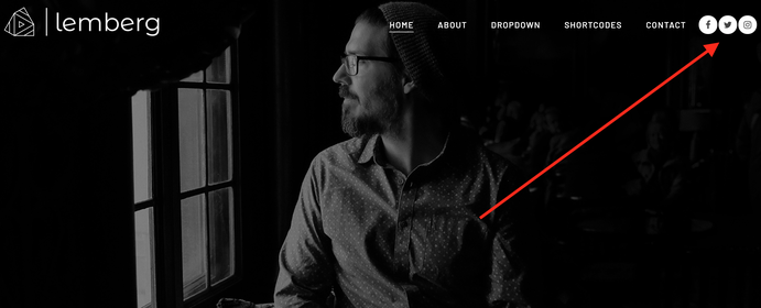
Header Social Links
In Matrix Theme menu go to "Components" and in Custom Widgets and select Social Icons
Paste the social icons code to your Footer section and edit it for your preference
When you click the save button, the social icons will be displayed in Footer. To move them to the header, just add a class hs-magic and refresh the page.
<div class="hs-magic hs-social is--flex new-social small-social hs-left size-11 is-circle-solid-white is-rounded link-dark">
...
Please note that even though your social media icons may be displayed in the header, you can edit them in the same position in the footer. You can access the Editor module by hovering your mouse over the icons. To ensure optimal usability, it is recommended to place the Editor module in the last position within the footer. Additionally, the class 'hs-magic' can be applied to buttons as well, in case you wish to display a button instead of social media links.
Top Header section
All Matrix themes provide an option to add a top header section above the main header, which can include contact information and other content. The methods for achieving this vary depending on the version of the theme you are using in your template.

To add a top header section in the latest version of the Matrix theme:
1. In the Footer (or sidebar), add a new module by selecting Widget/HTML.
2. Insert the following code into the widget:
<div class="draggable-top-header add-10 color-white link-white size-13">

<div class="fa fa-phone">
    </div>
    (+46) 432‑582-02,
    <div class="fa fa-envelope add-left-10">
    </div>
    <a href="mailto:office@mail.se">office@mail.se</a>

</div>
<div class="matrix-msg invisible">
    Edit Top Header section here
</div>
3. After adding the code, click the "Apply Styles" button in the style editor or simply refresh the page.
Upon refreshing, the content of your widget should now appear at the top of the header.
Even though this widget appears in the top header section, it works similarly to the header social links. You can still edit it in the Footer (or sidebar) from the same position where you originally added it.
To edit the widget, simply hover your mouse over the editor module, and you'll be able to make changes.
You can use helper classes like color-white, link-white, right-align, size-13, etc., directly within the widget code or in the style editor to customize the appearance of the content.
Another, more complex method (which might require additional styling) is to use variables. To do this:
1. Add a Widget/HTML module to the Footer (or sidebar).
2. Insert the following variable tag into the widget:
<var>draggable-top-header</var>
3. After inserting the code, click the "Apply Styles" button in the style editor or refresh the page. You will see your module appear at the top of the header.
This method should be used only if you want to display another Jimdo module, such as a search bar or share buttons, inside the top header section.
If you’re not using the latest release of the Matrix theme, the top header section must be edited directly in the HTML. To do this, go to Design > Custom Template > HTML and make the necessary changes there.
Style 2
<div class="draggable-top-header add-10 size-13">
    <div class="fa fa-home">
    </div>
    Hauptstrasse, 404 Hamburg
    <div class="fa fa-clock add-left-10">
    </div>
    Mon - Fri: 8AM - 5PM
    <div class="fa fa-phone add-left-10">
    </div>
    (+46) 432‑582-02
</div>

<div class="matrix-msg invisible">
    Edit Top Header section here
</div>
Style 3
<div class="draggable-top-header is-flex is-flex-block color-white hide-mobile">
    <!-- start first block -->

    <div class="is-matrix is-card br10 margin-5 is-anim-block is-flex is-flex-block no-padding">
        <div class="add-15">
            <div class="fa fa-home fa-2x">
            </div>
        </div>

        <div class="add-5">
            <h3 class="g-font size-16">
                Visit Us
            </h3>

            <p>
                Hauptstrasse, 404 Hamburg
            </p>
        </div>
    </div>
    <!-- end first block -->
    <!-- start second block -->

    <div class="is-matrix is-card br10 margin-5 is-anim-block is-flex is-flex-block no-padding">
        <div class="add-15">
            <div class="fa fa-phone fa-2x">
            </div>
        </div>

        <div class="add-5">
            <h3 class="g-font size-16">
                Contact Us
            </h3>

            <p>
                (+46) 432‑582-02
            </p>
        </div>
    </div>
    <!-- end second block -->
    <!-- start third block -->

    <div class="is-matrix is-card br10 margin-5 is-anim-block is-flex is-flex-block no-padding">
        <div class="add-15">
            <div class="fa fa-clock fa-2x">
            </div>
        </div>

        <div class="add-5">
            <h3 class="g-font size-16">
                Working hours
            </h3>

            <p>
                Mon - Fri: 8AM - 5PM
            </p>
        </div>
    </div>
    <!-- end third block -->
</div>

<div class="matrix-msg invisible">
    Edit Top Header section here
</div>
Style 4
<div class="draggable-top-header add-10 color-white link-white size-13">
    <div class="links inline-links has-divider">
        <ul>
            <li>
                <a href="https://www.matrix-themes.com/templates">About</a>
            </li>

            <li>
                <a href="https://www.matrix-themes.com/docs">24/7 Support</a>
            </li>

            <li>
                <a href="https://www.matrix-themes.com/templates/showcase">Showcase</a>
            </li>
        </ul>
    </div>
</div>

<div class="matrix-msg invisible">
    Edit Top Header section here
</div>
Smart menus
Select a design of the smart menu and paste it into your website inside the **Widget/HTML module**, which should be added to the footer to ensure it is visible on all pages.
Split menu
This option is available only for the old version of the Oland theme where you have a center aligned logo with the main navigation divided into 2 parts. The first three items of menu are placed on the left and the items from +4 - are right aligned. To change this value, you need to modify the following part in CSS:
/*** you hide the +4 items in the first left aligned menu ***/
.left-align nav ul li:nth-child(n+4) {
    display:none;
}

/*** you hide the first 3 items of your menu in the right  aligned menu ***/
.right-align nav ul li:nth-child(-n+3) {
    display:none;
}
The Oland theme has also an option to use a left logo with right aligned navigation.
Go to custom layout> HTML and add the class has-left-logo in global configuration line:
...
<div id="hs-container">
 <div class="global-colors brand-bg brand-link has-left-logo large-inner fullwidth-version has-custom-text">
....
Megamenu
The Mega Menu feature does not require any HTML knowledge and can be easily edited within the Jimdo template.
The functionality of the Mega Menu is as follows:
When you add a sub-level to your main menu, it will be displayed in the form of standard dropdown boxes. However, if you add an additional level (i.e. a 3rd level), it will be displayed in the form of a Mega Menu with 4 equal columns, providing a more organized and user-friendly navigation experience.
One pager
From April 2022 Matrix themes come with a new feature 'Landing pages',- a possibility to make any template onepager.
Please check the official documentation.
***
For the previous onepager Matrix theme 'Varmdo', please check this section with the detailed documentation.
<style>
/*<![CDATA[*/
.cc-section {
   margin-top: -100px;
   padding-top: 100px;
}

.cc-section:first-child .cc-section {
   padding-top: 100px;
}

@media only screen and (max-width: 1023px){
.cc-section{
   margin-top: 5px;
   padding-top: 5px;
}

.cc-section:first-child .cc-section {
   padding-top: 5px;
  }
}
/*]]>*/
</style>
<!-- start scroll nav menu -->
<div class="hs-menu onepager draggable-header">
    <nav>
        <ul>
            <li>
                <a href="#home">Home</a>
            </li>

            <li>
                <a href="#about">About</a>
            </li>

            <li>
                <a href="#service">Service</a>
            </li>

            <li>
                <a href="#contact">Contact</a>
            </li>
        </ul>
    </nav>
</div>
<!-- end scroll nav menu -->
<div class="matrix-msg invisible">
    Edit OnePager menu here
</div>
<div class="cc-section" id="home">
    <span>Home</span>
</div>
Multilingual themes
The Multilingual themes are using the standard Jimdo navigation (no dropdown) placed in 3 different position where the first level is used only for the language select.
Please make sure that using the multilingual template your navigation structure looks like this:
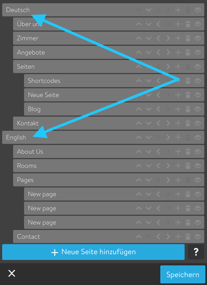
The latest multilingual Matrix themes don’t automatically display the first level, so you’ll need to add it manually using the Widget/HTML module in the footer section.
There are two options for displaying the language selector, depending on where you prefer it to appear:
1. Display the language selector in the top header section:
<div class="draggable-top-header">
    <div class="has-lang-nav has-divider">
    </div>
</div>
<div class="matrix-msg invisible">
    Display language selection
</div>
2. Display the language selector inside the header:
<div class="hs-magic hide-mobile">
    <div class="has-lang-nav snip-nav is--inline-block bg-primary br500 color-white --line03">
    </div>
</div>
<div class="matrix-msg invisible">
    Display language selection
</div>
As you can see from the code, there are various helper classes available to customize the style of the language selector widget. You can always edit the widget in the footer where it was placed, and after reloading the page, you’ll see the changes reflected in the desired section.
3. Using Smart Menus with dropdown box.
If there are more than 2 different languages, you can use smart menu feature with dropdown menu.
<a class="hs-button smart-menu-link small-btn bg-white br5 hs-magic hide-mobile" href="#" data-dropdown-target=".smart-menu3">Select a language</a>
<!-- Dropdown content can be anywhere, just needs the class referenced in data-dropdown-target -->

<div class="dropdown-content smart-menu3">
    <div class="links dropdown-links bg-primary add-10 cc-box text-left link-white br5">
        <div class="has-lang-nav snip-nav --line01 no-margin">
        </div>
    </div>
</div>

<div class="matrix-msg invisible">
    Edit Smart menus here
</div>
Adding simple links and dropdown language menu inside the top header section
<div class="draggable-top-header add-10 color-white right-align link-white size-13">
    <div class="links inline-links has-divider">
        <ul>
            <li>
                <a href="https://www.matrix-themes.com/templates">About</a>
            </li>

            <li>
                <a href="https://www.matrix-themes.com/docs">Contact</a>
            </li>

            <li>
                <a class="smart-menu-link" href="#" data-dropdown-target=".smart-menu13">Language</a>
                <div class="dropdown-content smart-menu13">
                    <div class="links dropdown-links dropdown-left bg-primary add-10 cc-box text-left link-white br5">
                        <div class="has-lang-nav snip-nav --line01 --effect03 no-margin">
                        </div>
                    </div>
                </div>
            </li>
        </ul>
    </div>
</div>

<div class="matrix-msg invisible">
    Edit Top Header section here
</div>
The helper classes are CSS Classes that used in Matrix themes to alter the global styles of custom widgets and elements
Default style of the widget 'Button'
<a class="hs-button" href="https://www.matrix-themes.com/" target="_blank">Button</a>
Default style of the widget 'Button' with additional helper classes:
<a class="hs-button bg-pumpkin mid-round size-18" href="https://www.matrix-themes.com/" target="_blank">Button</a>
In our second example we used the following helper classes:
bg-pumpkin - for background color
mid-round - for border-radius
size-18 - for font size
- The helper classes can be applied for any widgets in order to display different styles with padding, margin, colors etc
- For more details and full list of helper classes used in Matrix Themes, please check this post.
For a more detailed tutorial, complete with screenshots and examples, please visit the documentation page.
Documentation
Inline styles
When the default CSS styles and helper classes are not enough for your website, you can use the inline styles directly in Widget/HTML:
<div class="is-matrix bg-grey add-20" style="background:#bdcf0f1;padding:3px;border-radius:6px;">
  <center>
     <div class="fa fa-paper-plane fa-3x">
     </div>
     <h3 class="add-top-10 add-btm-10">
    Service 01
     </h3>
        <p>
      Nunc egestas, augue at pellentesque laoreet, felis eros vehicula leo, at malesuada velit leo quis pede. In ut quam vitae odio lacinia tincidunt. Quisque malesuada placerat nisl.
        </p>
  </center>
</div>
Theme configurations
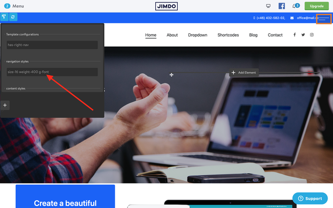
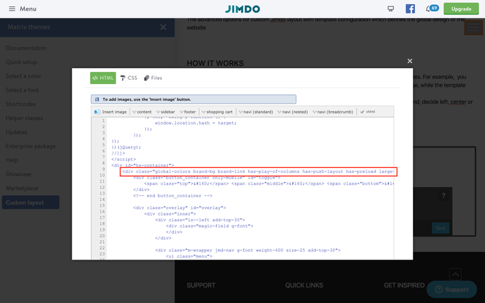
The template configuration is similar to that of custom body classes in Matrix themes. For instance, you can add the class "no-hero" to the "Edit Head" section in order to hide the hero image on a specific page. However, template configuration applies to the entire website and all pages, providing a more comprehensive level of control.
With the template configuration feature, you have the ability to easily define the background color of your header (white or dark), align your navigation (left, center, or right), and make other stylistic choices without the need to modify CSS code. This simplifies the customization process and allows for a more streamlined user experience.
From November 2021 all Matrix themes come with Advanced Style Editor so the below settings can be found directly in the style editor
Configuration options
- brand-bg - the template is using brand background color you set up in CSS
- brand-link - the brand color link you set up in CSS
- has-left-nav - left aligned navigation
- has-center-nav - center aligned navigation
- has-right-nav - right aligned navigation
- has-custom-text - custom font for the global text
- has-custom-nav - the last dropdown menu box has custom style
Play of columns
This feature has been currently replaced by Matrix variables and not available in the recent templates.
Image alt classes
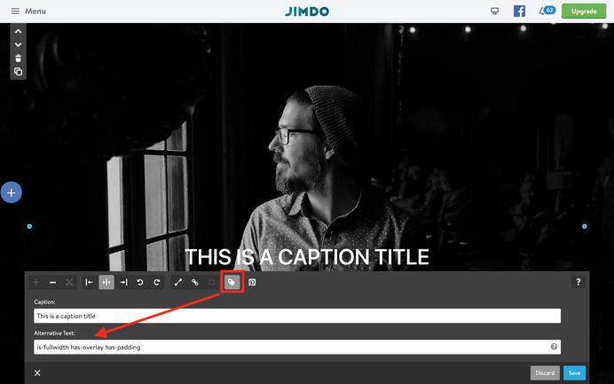
Image Alt classes refer to default customized Jimdo widgets that do not require any programming knowledge to use. Instead, you can utilize the "ALT text" field to manipulate various aspects of your images, such as making them fullwidth, adding parallax effects, and adjusting the border radius value. These features provide a user-friendly and intuitive way to enhance the visual design of your website without needing to write any code.
For a more detailed tutorial, complete with screenshots and examples, please visit the documentation page.
Documentation
Matrix Variables
Matrix Variables are custom tags that are utilized within columns to modify the appearance of the parent module, which is the Columns. These variables allow you to easily add any background color or change the styles of any element that is displayed within the columns. This feature provides a powerful way to easily modify the visual design of your website, without the need for extensive CSS knowledge.
Examples:
Display any content inside of your module 'Columns' ( text, images, contact form or any other element )
Inside of the one column, add the module 'Widget/HTML' with the following tag:
<var> hs-fullwidth bg-primary color-white </var>
Click the apply Style button of the style editor to see your columns wrapped in fullwidth brand background color and white text. You can further customize it for example your buttons or contact form
<var> hs-fullwidth bg-primary color-white white-outline-btn o-form </var>
For a more detailed tutorial, complete with screenshots and examples, please visit the documentation page.
Documentation
Problem with mobile version
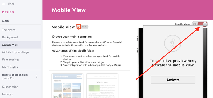
There are 3 common issues with the mobile version
The default Jimdo mobile version is activated. Go to Design> Mobile View and deactivate the default mobile version.
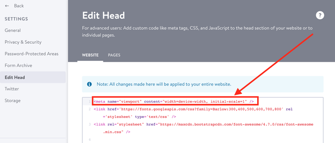
You removed the viewport tag from Edit Head section. Just replace the below line to Settings> Edit Head
<meta name="viewport" content="width=device-width, initial-scale=1" />
Note: the latest Matrix themes the viewport tag have directly in HTML
You made an error in CSS. Check the latest changes in CSS made by you.
External Js files
The common problems with js files or script added in Edit Head section.
- Adding any external script to Edit Head, you don't need to include a jQuery library which is already added in js file 'matrix.js'
- If you add a js file to the folder Files ( custom template> Files), make sure you're adding a minified version.
Do you have any further questions?
Just ask here!






Support team (Saturday, 26 October 2024 17:08)
@Michael Hallo, im Matrix Theme Admin-Menü gehst du zu Shortcodes und wählst das Widget Slider aus. Mit der Kopieren-Schaltfläche kannst du den Code in das Widget/HTML-Modul deiner Website einfügen, wo du die Slideshow anzeigen möchtest. Weitere Stile und Optionen für den Slider findest du im Abschnitt Add-ons
Michael Dommes (Saturday, 26 October 2024 16:55)
ich möchte im Matrix Theme auf der HOME webpage Änderungen vornehmen, zb das Bild wechseln, wo finde ich den programmierten Text in dem ich Änderungen vornehmen kann - oder einfach gefragt wie änder ich Inhalte im Matrix Theme auf der Seite HOME?
Alice (Saturday, 13 May 2023 12:11)
How can i make the hero image full page so there is no margin to the edge?
stoobz (Thursday, 28 July 2022 22:43)
Hey hello, I wanted to place a message on top, that I am away on vacation. I put it with the social Media icons into the footer, so that it shows up on top.
And it works, but only for the desktop-version.
On my mobile it appears in the footer.
</style><div class="hs-social left-align new-social small-social size-11 is-circle-border link-bright is-rounded hs-magic">
<font size="4" color="white"><marquee width="600" height="25">Hallo ihr Lieben - wir machen kurz Sommerferien und sind ab dem 18.8.2022 wieder für euch da ;)</marquee></font> <a href=
"https://www.pinterest.de/stubenrauchhamburg/" target="_blank" class="fa fa-pinterest fa-2x add-right-5"></a>
</div>
<div class="only-mobile">
<font size="3" color="white"><marquee width="300" height="25">Hallo ihr Lieben - wir machen kurz Sommerferien und sind ab dem 18.8.2022 wieder für euch da ;)</marquee></font>
</div>
Can you please tell me what I am missing? THanks alot in advance!!
Cheers,
stoobz.
Matrix themes (Friday, 01 July 2022 18:18)
@Stefan B
https://www.matrix-themes.com/support/documentation/#link8
or in Matrix Theme menu >Quick setup
Stefan B. (Friday, 01 July 2022 13:53)
Hello,
how can I move my logo so that it appears in the upper left corner of my website and will then appear within the navigation bar?
Matrix themes (Wednesday, 06 October 2021 10:01)
@Erika no, it's not possible
Erika B. (Wednesday, 06 October 2021 01:38)
Hallo,
thank you for the previous support.
Can you tell me please if it 's possible to get the WHOLE contact page in one color ( not only the header ) , except the contact "window" ( which can stay white ). Have it seen so many times on th internet. And I wonder if it's possible in here.
My theme is New York by the way.
Thank you for you help.
Best Greetings
Matrix themes (Monday, 04 October 2021 09:55)
@Erika https://help.jimdo.com/hc/en-us/articles/115005538586
Erika B. (Monday, 04 October 2021 04:05)
Hallo,
the hero pictures of my website are not responsive on the mobile version/ I see only one part of them. What could be wrong?
Matrix themes (Wednesday, 27 January 2021 22:51)
@Carsten the class lazy should be used for a single module or widget and never for the whole website
Carsten Mueller (Wednesday, 27 January 2021 14:05)
There is LazyLoad installed on our website. Is it working for the whole website, or do we need to add an attribute to every picture to have it function?
Thank you.